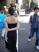
no, not that kind.
****************************************
i'm kind of really loving april right now for these two Loverly invitation designs. you know she's all sorts of awesome because the only criteria i gave her were my three words, this picture, and the fact that i like cursive.
and she created these beauties.
#1:

#2:

which would you choose?
p.s. i don't plan to include the above rsvp return cards. it will most likely just be a separate card with instructions to rsvp online and hotel info for our out-of-towners.
p.p.s. a real conversation:
me: oh...one thing i noticed...the first word is spelled incorrectly.
april: the repondez?...i double checked the spelling...i must be missing it...
an hour later.
me: i'm a complete loser. i totally thought it was supposed to be reSpondez.
april: no problem. have a great day!
moral of the story? she's really nice. and i don't know any french. mai oui!
Friday, November 28, 2008
#443: #1 or #2?
Subscribe to:
Post Comments (Atom)


29 comments:
THey are both gorgeous, but my vote goes for #2.
I didn't know that it was "repondez" either. oops :)
numero uno!
I would say #2! I love the tree in the first though..
I love #2!
#1 is my vote! #2 is a more common design that I have seen around, so while it is super cute, I think #1 is more unique.
Have fun with it, whichever you choose!
I love number 2 - the color and design feel a bit less intense and I love that color so much! Nice choices.
i think #1 is aaaaammazing stunning. especially in comparison to #2
OMG they r both beautiful and unique! Go by color- Which is going to be the accent color at your wedding?- use that one! (But I do love the teal, its used less than the pink )
Love them! I think 1 is more bold and simple, 2 is more romantic. I like number 2 best myself.
I always thought it was respondez too so you're not the only one...
ooh number 1 is the bestest. wow, turns out my high school level french is also a pile of crap.
Another vote for #1!
i love the design--it's so clean! i like #2 a little better, but both are lovely.
I like 2 the best but I think that's mostly because that color is just fantastic. It's gorgeous.
i like no. 1. i think it incorporates your inspiration the best.
#2, #2!!!!
They are both lovely, but I like number 2 better. It may be because fuchsia isn't really my color.
I am voting for #1 after looking at your picture and words...
I love them both but based on the inspiration pic, I'd say #1. I really like #2 and love the teal but I wish it used more pink.
Also, I think you mean "maiS oui" (mai means May) :)
#2!
I vote for #2! Love it!
love #1
isnt april lovely!? she designed my invitations! i love both of your choices!
Either one would be amazing! The only thing drawing me to number 1 is the color, it is awesome!
I was going to compliment the designer on her French knowledge... she even got the accent on the "plait"! And I vote for #2. It's gorgeous.
they are both wonderful, what a great dilemma to have. my vote is for #2!
I am jumping up and down with enthusiasm for #1!
I say No 2 too! I love it!
#1. definately.
Steph is right. (Francophiles, rejoice!) Mais oui means "but of course!" Say it in your best Louis Jourdan/Maurice Chevalier voice.
Post a Comment